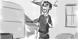
Now, usually the next step would be to go through the audio a few hundred times and do some thumbnails and really try and come-up with a good performance, but since we have to create everything from scratch we will start with the boards. So, below you will find rough boards, since I didn’t need too much from them I kept them simple and straightforward. Simple camera and composition that framed the animation.
Keeping in mind that I am not a storyboard artist and would never belittle what those amazing artists do, I took a whack at it. To help me set up the boards
I gave myself a small back story to the character, something that will help me to know where he is coming from in the previous scene and where he is going after it. That way it’s not just a one-off monolog shot with no connection to anything. To me, this always helps to anchor test shots and give them a little
more substance, and takes away from feeling like every other test shot I have seen on a reel.
In the end you want someone to look at the shot and say Wow, I could totally see that shot being a part of a feature film
. I know people always say Well, if the work is good it will stand out
. While that is true, the people that review reels can go through 200 every week and you need/want yours to stand out. The worst thing is if they say, Yeah, it’s okay, but I have seen 100 just like it
. It becomes much more common with the overuse of one rig and the same setup of shots that are very similar in idea and composition.
Okay, now that, that rant is over back to boards… After my back story, which I set up as the character is living in the back of a small county gas station, and he is caught mid conversation sarcastically talking about his financial situation. The SQ is that he is just getting up and dusting himself off before going back to work.
Small thumbnails strung together for a basic idea of the shot scenario
Final boards based on the 3D/CG location and composition planning
Here you will find the boards that I did (be kind, and I think I went a little overboard with the boards, they became a precursor for my thumbnails planning) and then took them into flipbook to time them out and make a little animatic as a guide for the layout stage. It’s simple and straightforward, which is all I need to help me frame my animation and make it stand out!
Above are two examples, the first was a rough first impression, one I did just to get an idea of what I might do. The second is more tied down and was based on what I had set up for the CG background, so I know more or less what the composition would be like.
Next post we will dive into my addiction, breaking down the audio and starting to try and bring a performance to life in planning.


A great post to start with. Looking forward to reading how you tackle the next piece of the puzzle. 🙂
i m impatiently waiting for your next post!!
Great Post Tal !
Waiting for the next step …
Comments on this entry are closed.